When it comes to website design and on-page SEO, the focus is often on user experience, above the on fold text and SEO elements, like meta descriptions and title tags.
Often little attention is given to the footer of a website. Yes, your site’s footer is not only an important contributor to your site’s SEO, but it also helps to create an exceptional user experience.
The footer comes in handy to further help with branding. It also helps users to get an idea of what your site is about if they don't want to read or watch all of your site’s content, or if they are looking for specific information.
Just like the CTA (Call to Action) button, the footer helps guide your users to know what they should do next, instead of making them feel like they have hit a dead end.
In this article, we look at why the footer is a vital part of your site and the best practices when creating one.
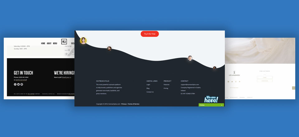
Image source - Elegant Themes
Why is Having a Footer Important?
Users take time to scroll through your site or webpage, all the way to the bottom. Here are several ways that having a footer makes your SEO more effective, creates better user experiences and helps with compliance:
Creation of Internal Links
Your footer is an opportunity to include internal links to other webpages or parts of your site. This makes navigation easier on mobile, where users would have to scroll all the way up if they needed to access a particular part of your webpage.
Having a footer gives you a chance to ensure that your site has no dead-end pages.
Internal links help search engine bots to crawl your page and determine the relationship between pages and content, and their relevance and value.
Prompting for Action
If you had wanted your users to take a particular action on the webpage, for example, downloading a free ebook, the footer gives you one more chance to do so, just before they leave.
Easier Navigation
Footers make it easier for users to navigate the site. If they want to go to the services page, for example, all they need to do is click the link on the footer and they will be redirected to the specific services page, without having to scroll all the way to the top navigation bar.
Links to Brand Properties
The footer is a link to other brand properties, for example, social profiles links, which makes it easier for users to contact or follow you on social media.
It also includes information that results in increased customer confidence like copyrights and disclaimers.
A Source of Important Information
If your users want to contact you, for example, adding that information will make it easier for them to do so without spending more time looking for your company’s number. The footer also allows you to add more information like copyright and disclaimers.
Helps with Passing Link Equity
When you add internal links to your footer, you allow the page from which the link originates to share link equity with the pages it links to.
For example, if the page you are linking to has an inbound link from an authoritative page, then that equity is passed to the page where the footer’s navigation link is.
Helps to Build Credibility and Trust
The footer gives you an opportunity to comply with legal requirements, for example, showing copyright information, your privacy policy, a disclaimer and terms of use. It also lets your users know that your site is secure if you add a security certificate for example.
The footer is also a great place to show your expertise, depending on the industry that you are in, for example, BBB accreditation, Google certifications, and GSA certifications.
What to Include in Footers
In this section, we look at the most important elements that you should never leave out in your footer:
Copyright Information
Even if your site’s footer lacks anything else, it must have copyright information. This information clarifies that your content is not to be plagiarized, and if someone does, you can take legal action.
This article discusses the different types of copyright infringements and when it is possible to sue.
The copyright information should not be illustrious as it is not the footer’s main information. Here is an example of a footer that shows copyright information:
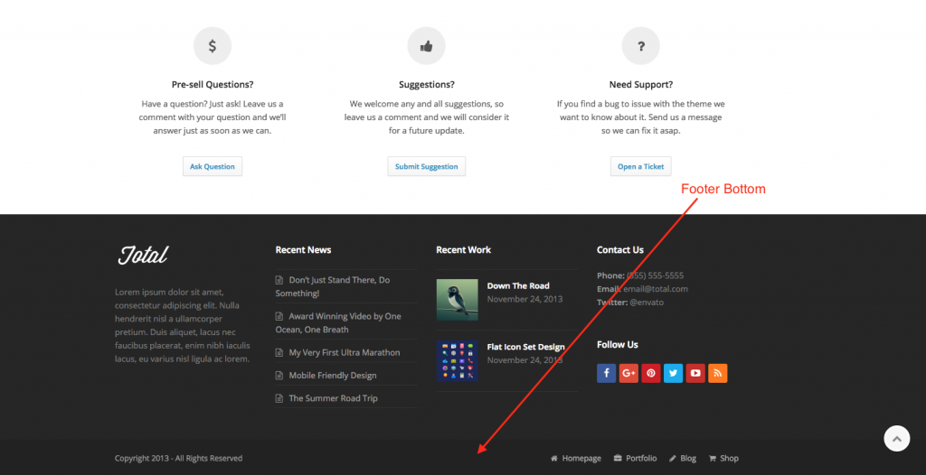
Image source WP Explorer Themes
The good news is that you don't need to worry about having to manually keep the copyright information up to date. You can set code to automatically update that.
Contact Information
You want to make it easy for your customers to reach you after they have interacted with your content. The footer gives you an opportunity to do so without the customer scrolling all the way up.
Adding location information also helps customers who want to visit a physical location to find directions. You may also want to add the actual contact form on the footer itself.
The contact information could form part of your marketing analysis. You can get to know the number of people who click on the call button, for example.
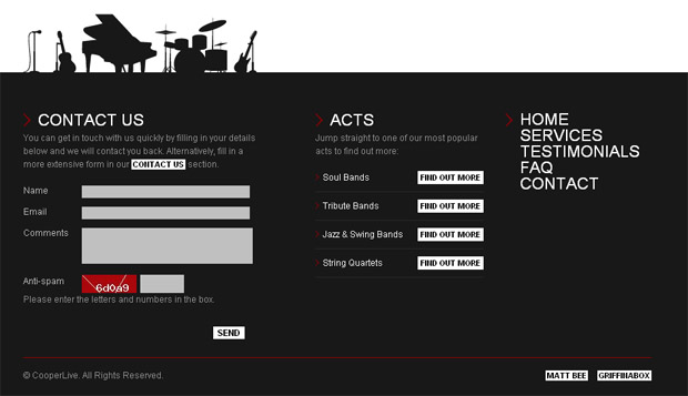
Image source More Conversion
CTA
Your CTA will be determined by what you want your users to do before they leave the site. It could be signing up for your newsletter or following you on social media. Here is an example of a footer using a CTA:
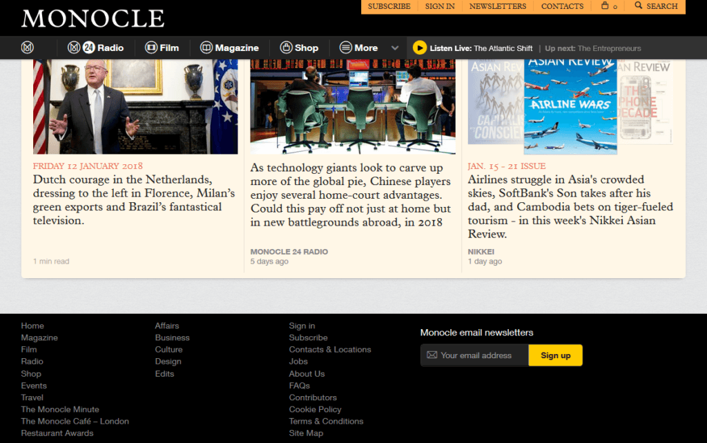
Image source Monocle
Footer SEO-Best Practices
When creating content, what you should always focus on is the content, your footer’s structure, and its appearance. Here are best practices when creating footers:
Simplicity is the Best Way Forward
While footers are aimed at making the user experience better, having too much information in the footer could be counterproductive. You do not want your users to sort what is or isn’t important for them.
Focus on primary links that they may look for, for example. Here is an example of an ‘crowded’ footer.
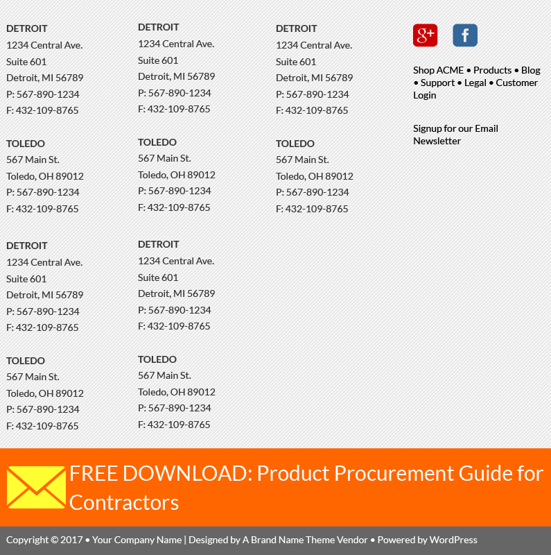
This footer did not have to list the location of 10 addresses. A link to the locations and a short description would have done the job. If you have over 3 locations, here is an example from WeWork who has multiple locations.
They have a dedicated page providing their location, instead of adding all of their locations in the footer.
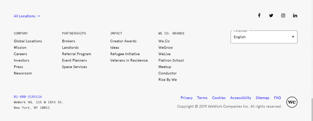
Image Source WeWork
Have Only One CTA
Include CTAs on different pages, for example, on your products page you may need to add a CTA that directs your users to a demo link that shows how your product(s) work.
In this situation, since your footer will be accessed from all the pages on your site, you may want to avoid having another CTA in your footer. Alternatively, make the CTA generic, for example, ‘sign up to our newsletter’.
You do not want to have more than one CTA in your footer, for example, ‘see our demo’ and ‘sign up for our newsletter’ as in our products page example. The demo link may not be relevant on all the pages. CTA should stay as generic as possible.
Here is an example of a clear CTA:
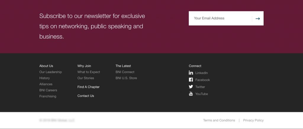
Image source:https://northstreetcreative.com/media/bni.jpg
As you can see, the CTA is prominent. It should stand out from the rest of the footer content as it is the one that is directing people on what to do next. Ensure that your visitors can fulfill the required action right from the footer.
For example, if they need to sign up, there should be a form that they can fill.
Keep it Organized
It is almost a rule of thumb that the most effective footers are organized and divided into at least 3 sections. This way, your users get an idea of how your site is organized.
You can have a section about your company, another about the services you offer, and another containing your contact information.
Here is an example of a well-organized footer:
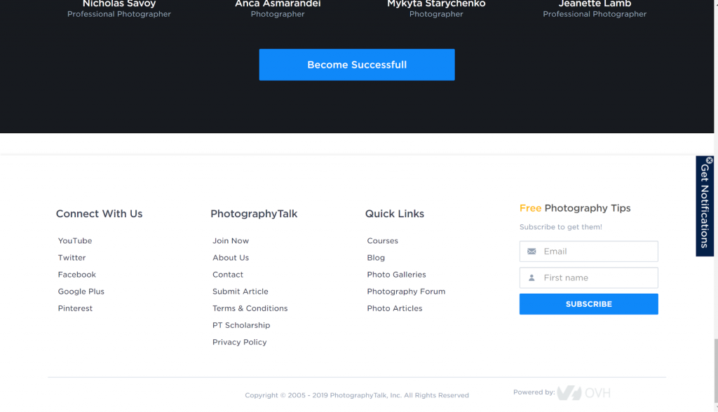
Source PhotographyTalk
Always Link to Other Sections or Pages on Your Site
It is not enough that you list different sections or webpages on your footer. Provide a helpful user experience and navigate your users to the right areas. Only include the most important pages or sections as links in your footer.
Here’s an example of how Hubneo a VR arcade company organized their footer to provide different services and information:
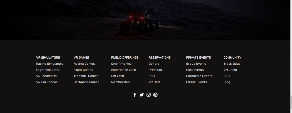
Source Hubneo VR Lab
Keep the Branding Consistent
Use your theme colors and logo in your footer. Also, use the same font types that you have on the rest of the site. Using contrast will make your footer dynamic.
The CTA might have a larger font size for example, and the copyright information, a smaller font size.
Provide Secure Payment Information
If you are selling products or services, provide information SSL security of your site:
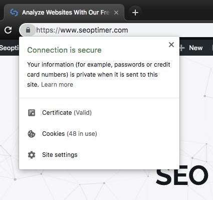
But also on what type of payment you accept on your footer section

Source Topexplainers
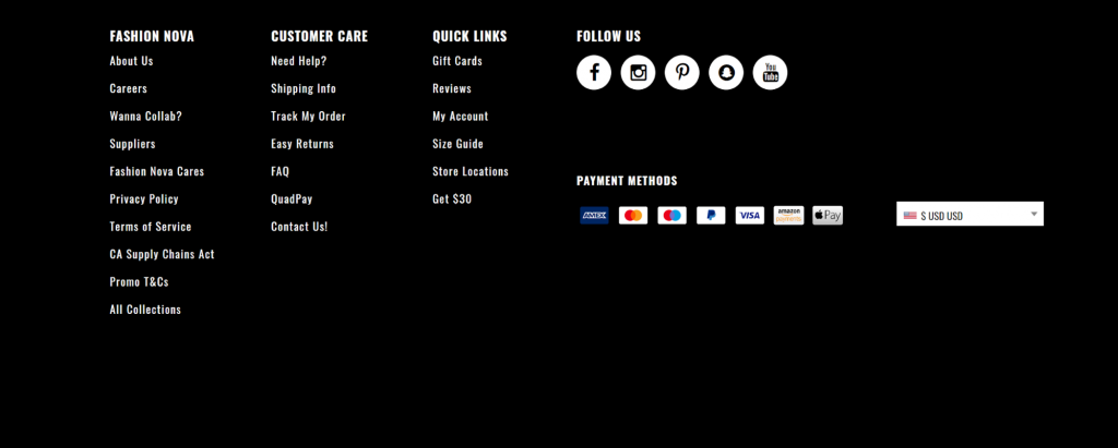
Source Fashion Nova
Make it User-friendly
For better user experience, you want a back to the top button so your users don’t have to scroll all the way back to the top, if your site contains a long for content.
Adding other user experience like live chat is also great opportunity for you to engage with your audience. However, keep in mind where these should be located so it does not overlap each other.
In Conclusion
Your site’s footer gives you one more chance to interact with your users before they leave. You could get them to subscribe to your newsletter, contact you or follow you on social media.
It also makes it easier for them to find the specific information they may look for about your company. The footer SEO is also important for your overall SEO strategy. It pays off to invest time to ensure that your footer is SEO and user optimized. This article has just given you the way to achieve this.
